Guide
Designing your label
Last updated: April 2026
You have full design freedom on your label — these guides are here to help you get the best possible result. Sharper images, truer colours, cleaner cuts. If anything is unclear, email us at hello@dotcan.com.
Default specs · 330 ml standard · artwork upload
- Upload size (with bleed)
- 170 × 91 mm
- Visible artwork on the can
- 167 × 85 mm
- Final printed label
- 207 × 85 mm
- Producer info panel
- 40 × 85 mm (we add it)
- Bleed
- 3 mm — left, top, bottom
- Safe zone
- 161 × 79 mm
- Resolution
- 600 DPI recommended
- Colour mode
- CMYK preferred
- Accepted formats
- PDF, PNG, JPEG, SVG
- Orientation
- Landscape (long edge wraps the can)
Custom info panel mode — upload the full 213 × 91 mm label (with 3 mm bleed on all four sides) when you want to design the info panel yourself. Paid add-on at checkout.
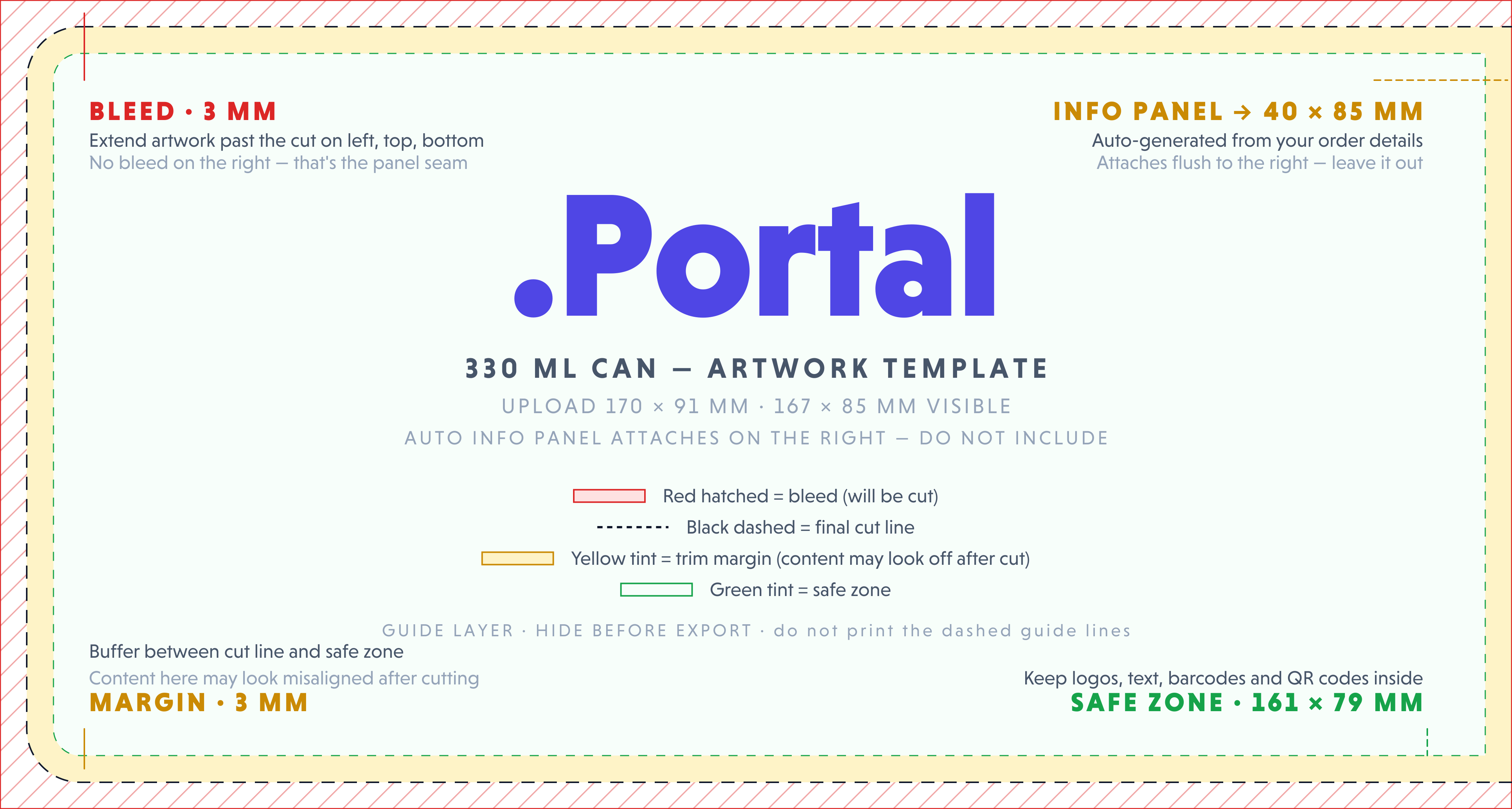
01. Label dimensions
Every can in our 330 ml line uses a single label size — 207 × 85 mm — that wraps horizontally around the can. The long edge wraps the circumference; the short edge is the visible height. Most of the label is your artwork; the right 40 mm is the producer info panel.
The producer info panel — ingredients, nutrition, allergens, barcode — is generated automatically from your order details and added to the right edge of the printed label. You don't include it in your file. Your file is just the artwork; we add the panel beside it on press (see section 08).
Two upload modes
Default — artwork only. Upload at 170 × 91 mm (with 3 mm bleed on left, top and bottom). Visible artwork on the can is the inner 167 × 85 mm; the right edge of your file is the seam where the info panel attaches, so no bleed there. Nothing is reserved or overlaid — what you upload is what gets printed in the artwork region.
Custom info panel — paid add-on. If you want to design the panel yourself (matching your typography, integrated into your art), pick the "custom info panel" add-on at checkout. You upload the full 213 × 91 mm label (3 mm bleed on all four sides) and we don't add anything — the entire 207 × 85 mm printed label is yours. The compliance content still has to be correct; we'll review it.
Always upload at the recommended size for your mode, even if your design doesn't reach the edges. Our system needs the bleed area to handle the cut.
02. Bleed & safe zone
Cutting a printed label is precise but never perfectly so. The blade can shift by a fraction of a millimetre between cuts. Bleed and the safe zone are how we account for that.
Bleed
The 3 mm strip outside the cut line where artwork extends past the edge. If your background is a solid colour, that colour must continue all the way to the edge of the upload. If the blade cuts a hair off-target and there's no bleed, you'll see a thin unprinted strip along the edge of the cut label. With bleed, you won't.
In default (artwork-only) mode, your file has bleed on three sides — left, top, and bottom. The right edge is the panel seam: the auto info panel butts up against it, so no bleed is needed there. In custom info panel mode, you're uploading the full label, so bleed is needed on all four sides.
Safe zone
The 3 mm strip inside the cut line where you should never place anything important — text, logos, faces, key graphics. Same reasoning in reverse: if the cut shifts inward, you don't want your logo getting clipped.
You upload the 170 × 91 mm artwork on the left. We add the 43 mm info panel on the right at print time. Together they form the printed 213 × 91 mm sheet, die-cut to a 207 × 85 mm label.
03. File formats
Four formats are accepted, in order of preference:
| Format | Best for | Notes |
|---|---|---|
| Designers, agencies, anyone using Illustrator, InDesign, or Affinity | Preferred. PDF/X-4 is ideal — colour-managed, fonts embedded, transparency flattened. | |
| SVG | Vector designs from Figma, Inkscape, or hand-coded artwork | Embed or outline fonts. We rasterise SVGs at 600 DPI for print. |
| PNG | Designs from Canva, Photopea, or any web tool | Export at 600 DPI. Use a white background, not transparent, unless you specifically want bare label. |
| JPEG | Photo-heavy designs, print-from-camera | Use highest quality (95 %+). Lossy compression can introduce artefacts at small sizes. |
Exporting from working files
If you're working in Illustrator, InDesign, Photoshop, or Affinity, export to PDF before uploading. PDF/X-4 is the safest target. In Illustrator: File → Save As → Adobe PDF → PDF/X-4. In Photoshop: File → Save As → Photoshop PDF.
04. Resolution
Resolution determines how much detail survives the trip from your screen to the printed label. Too low, and edges go fuzzy. Too high, and you're just making bigger files for no gain.
We'll print whatever resolution you upload — this section is about what to expect from each.
| DPI | Pixel size at 170 × 91 mm | Result on the printed can |
|---|---|---|
| 72 DPI | 482 × 258 px | Visibly pixelated. Edges look like staircases. |
| 150 DPI | 1004 × 538 px | Soft and fuzzy. Small text becomes hard to read. |
| 300 DPI | 2008 × 1075 px | Sharp and clean. Acceptable for most designs. |
| 600 DPI | 4016 × 2150 px | Recommended — pristine. Photographs look photographic. |
Custom info panel mode uses the full label, so pixel targets are higher: at 213 × 91 mm and 600 DPI, that's 5031 × 2150 px. There's no benefit to uploading higher than 600 DPI — beyond that, file size grows but visible quality doesn't.
05. Colour spaces
Your screen makes colour by mixing red, green, and blue light — that's RGB. Our printer makes colour by mixing cyan, magenta, yellow, and black ink — that's CMYK. The two don't perfectly match.
RGB has a wider colour range than CMYK, which means some bright, saturated colours you see on screen — neon greens, electric blues, pure reds — simply cannot be produced with ink. If you submit an RGB file, we'll convert it to CMYK during print prep, and those out-of-range colours get pulled toward the closest printable equivalent. The result is usually a slightly muted version of what you saw on screen.
What to do
- Best: design and export in CMYK from the start. In Illustrator, File → Document Color Mode → CMYK. In Photoshop, Image → Mode → CMYK.
- Acceptable: design in RGB, soft-proof to CMYK before exporting (Photoshop: View → Proof Colors) so you can see what to expect.
- Risky: design in RGB and ignore the conversion. The colours you see on your monitor are not what will print.
If your brand depends on an exact colour match, send us the Pantone reference and we'll find the closest CMYK build during our manual review.
06. Black handling
“Black” is two different things in print, and using the wrong one is one of the most common rookie mistakes.
Use 100 % K for body text, thin lines, and barcodes — a single ink prints crisper. Use Rich Black (C 60 · M 40 · Y 40 · K 100) for large dark fills, where 100 % K alone tends to look thin and brownish.
07. Fonts & type
Printing on PP label stock is sharp, but it has its limits. Tiny text, hairline strokes, and over-thin fonts can break down at the press.
Rules of thumb
- 6 pt or larger for any text you actually want people to read. Below that, characters lose integrity at the press.
- 4 pt absolute floor for fine print in monochrome — and only if the typeface is robust (no hairline serifs).
- 8 pt or larger for ingredients, instructions, and anything where readability matters.
- Avoid extra-thin or hairline weights. The strokes can drop out at small sizes. Stick to regular or medium weights for body copy.
- Outline or embed your fonts when exporting PDF. PDF/X-4 does this automatically.
08. The producer panel
Every can of food or drink sold in the EU is required by law to display certain information: the producer, the ingredients, allergens, nutrition facts, country of origin, net volume, and a barcode. Together, these form the producer panel.
.Portal generates the panel for you, automatically — built from the order details you provide at checkout. You don't include it in your file, you don't draw it, and you don't leave space for it. You upload your artwork at 170 × 91 mm; we add the panel to the right edge of your artwork on press; the two are printed and die-cut as a single 207 × 85 mm label.
The panel is a fixed 40 mm strip, always on the right edge of the assembled label. Because we add it after your upload, your file is just the artwork — there is nothing to design around.
- 1Product name — Bold, centred, top of panel.
- 2Ingredients — Auto-formatted; allergens appended inline as 'Allergens: ...'.
- 3Storage — Cool/dry instructions and best-before reference.
- 4Producer & origin — Cannery details + country of origin, in a single line.
- 5Nutrition table — Per 100 ml — energy, fat, carbs, protein, salt.
- 6Net volume + ℮-mark — Large, ≥ 4 mm characters, right-aligned.
- 7EAN-13 barcode — Vertical (ladder) orientation, 25 mm scan height.
- 8Data Matrix · ALU — Traceability code and aluminium recycling triangle.
Layout, content and typography are fixed by EU food law. The panel always sits at the right edge of the label.
Position, width, and content are fixed
The panel is always 40 mm wide, always on the right edge, and you cannot edit anything inside it: not the order of fields, not the typography, not the barcode placement. These are constrained by EU food law and we keep them locked so the result is guaranteed compliant.
Add-on: design it yourself
If you want the info panel integrated into your design — matching your typography, your accent colours, your layout — pick the "custom info panel" add-on at checkout. In that mode, you upload the full 213 × 91 mm label and we don't add anything; the entire 207 × 85 mm printed label is yours. The compliance content still has to be correct (we'll review it), but the visual is yours.
09. Templates
The fastest way to get your file dimensions right is to start from the artwork template. It's sized to exactly what we expect: 170 × 91 mm with bleed pre-marked on the left, top, and bottom. The right edge is the panel seam — no bleed there, and no info panel content for you to design around. Open it, drop your design in, hide the guide layer, export at the same size.
10. The review process
Every design is reviewed manually by our team before it goes to the press. The review isn't there to second-guess your design choices — we'll print whatever file you give us. It's there to catch the small handful of issues we genuinely can't print, and to flag potential quality concerns so you can decide whether to fix them or proceed.
What happens after you upload
- You upload and order. Your file goes into the review queue.
- We review (typically within 24 hours). We open your file, check it against our compliance checklist, and prepare a digital proof.
- One of three things happens:
- All clear — we send you the proof. You confirm, we go to print.
- Quality concern — we email you with what we noticed (e.g. low resolution, vivid RGB colours likely to shift, text close to the cut line). You can fix and re-upload, or accept and proceed. Your call.
- Hard issue — if something genuinely can't be printed, we explain why and ask for a new file. No charge for re-uploads.
- You sign off on the proof. No design goes to print without your written approval.
What we'll always print
If you've seen the proof, signed off, and your design isn't on the list below, we'll print it — even if we'd have made different choices ourselves. Resolution, colour vibrancy, font sizes, contrast, layout — these are stylistic decisions, and they're yours to make.
What we won't print
- Illegal content — anything that violates EU or Estonian law.
- Infringing content — third-party logos, copyrighted characters, trademarks, or designs you don't have the rights to use.
- Customer-drawn compliance content in default mode — ingredient lists, nutrition tables and barcodes have to come from the auto info panel unless you've opted in to the custom info panel add-on.
- Technically unprocessable files — corrupt PDFs, files we can't open, or dimensions so far off we can't make them fit.
- Total ink coverage above 300 % — this isn't a stylistic choice, it physically damages the print. We'll suggest a small CMYK adjustment.
Outside of the above, the choice is yours. We'd rather you make an informed decision than have us gatekeep your design.
11. Quality pitfalls
These are the issues we see most often. None of them stops us from printing — but each one will visibly hurt the result. Worth checking your file against this list before you order.
Each of these can be fixed in minutes once you know what to look for. The templates above prevent most of them automatically. And if you upload one anyway — we'll mention it during review, but the call is yours.
12. Need a hand?
If you're stuck, unsure whether your file will work, or want us to look at something before you order — write to us. We answer fast.